For Recruiters
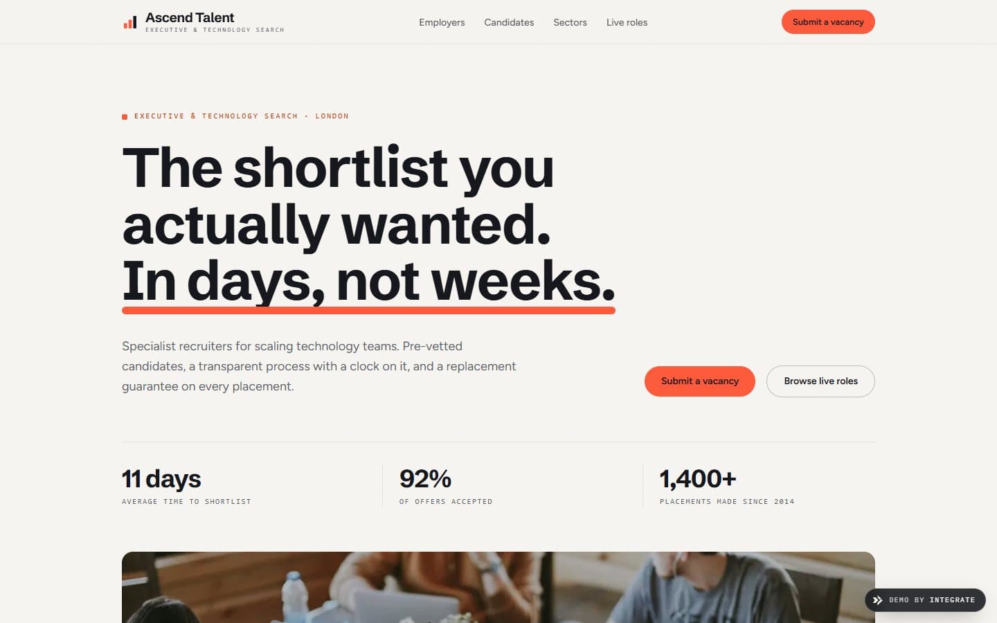
The anti-spam recruitment site: it reads like a firm you'd actually hand a brief to, not another agency filling your inbox.
The brief
Recruiters have an image problem: too many inboxes hit with the same generic CV. The job here was a site that feels like the opposite of that, considered and a little premium, and one that lets employers and candidates each find their own path without one talking over the other.
The audience
Two groups that don't overlap much. Hiring managers who've been let down by agencies that fire over twenty CVs and hope one sticks. And senior candidates who aren't about to hand their details to just anyone. Both need to feel the firm is picky in a good way.
Why it works
Light background, big editorial type, one warm coral. It reads as a firm that puts people first and isn't trying too hard. Right at the top there's a clean Employers / Candidates split, so each side gets one click to their own content and neither has to sit through the other's pitch.
Design intent
In detail
How the page is put together.
Each section earns its place. Below, the decisions that make this a recruiters website and not a generic template.
A door each
Employers and candidates get their own entry point, weighted the same. Nobody scrolls past a pitch aimed at someone else to reach the part that's for them.
Lead with the numbers
Time to shortlist and offer-acceptance rate go near the top. When a company hires a recruiter what they're really buying is speed and a candidate who says yes, so the site opens with exactly that.
Real faces, not stock
The layout holds room for the actual consultants and named client quotes. The moment real photos exist they become the thing you notice, with no smiling-handshake stock standing in for people.
Let's build yours
Want a website like this for your recruiter business?
Tell us about your business and how you win customers. We'll design a site built to sell the way you actually sell.