For Accountants
Calm and precise, so a founder handing over their books feels like they've finally picked the grown-up option.
The brief
An accountant is asking you to trust them with the numbers that keep the lights on, so the site has to feel calm and sure of itself. We wanted 'established' without the dated beige, and the cloud-first, advisory side of the firm made obvious rather than left to a services list.
The audience
Founders and finance leads deciding who gets their books. They're weighing whether the firm is rigorous, whether it'll actually reply, and whether it's a step up from whoever did the accounts last year.
Why it works
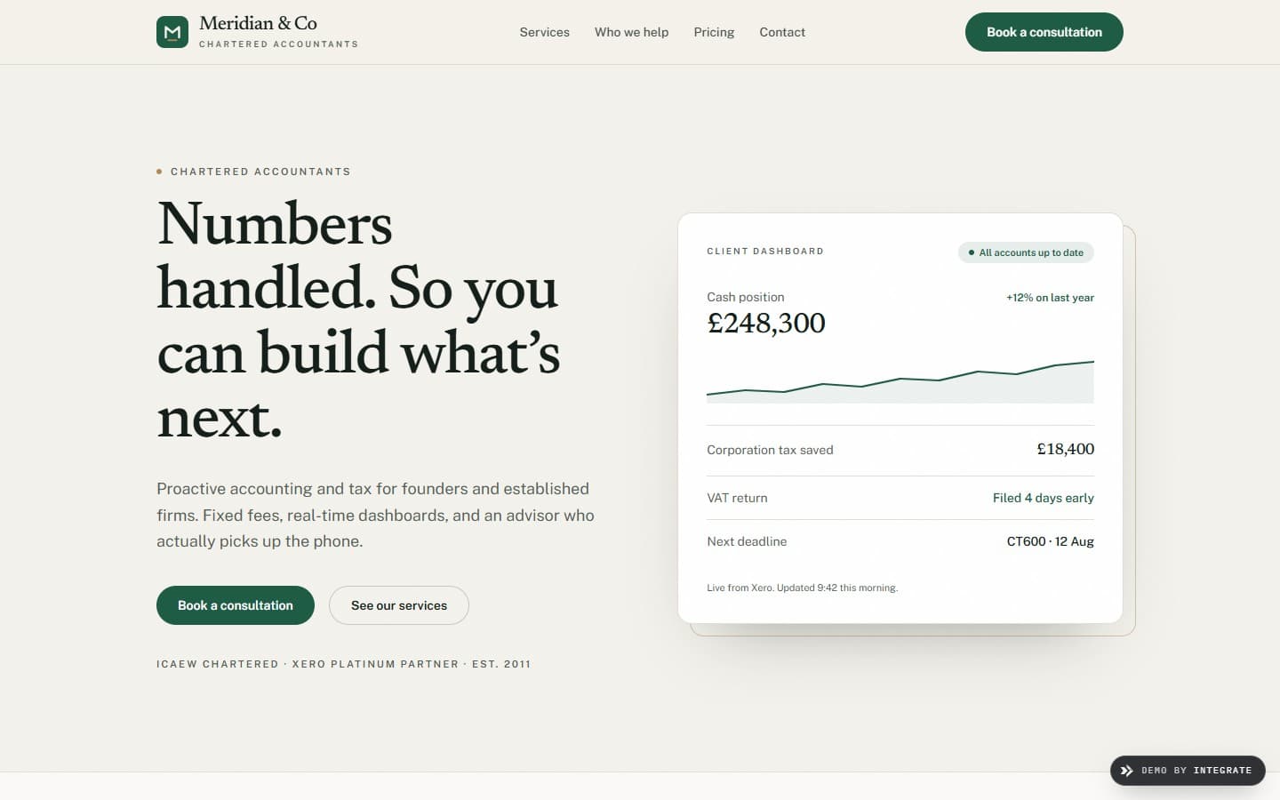
The hero splits in two: a plain, confident line on one side, a live-looking figures panel on the other, so the cloud-first bit is shown rather than claimed. Deep ledger green on warm paper feels trustworthy and adult, and stays well clear of the tired corporate blue every other firm reaches for.
Design intent
In detail
How the page is put together.
Each section earns its place. Below, the decisions that make this a accountants website and not a generic template.
The headline sits next to the numbers
Straight-talking copy on one side, a tidy figures panel on the other. 'Numbers handled' is a lot easier to believe when there's a dashboard right beside it proving the point.
Fixed fees, said early
The main reason people bounce off an accountant's site is wondering what it'll cost. So the fixed-fee message gets room near the top rather than hiding behind a 'contact us for pricing'.
Pick your sector
Founders, trades and professional-services firms each get their own way in, so a visitor lands on proof about businesses like theirs instead of a one-size pitch.
Let's build yours
Want a website like this for your accountant business?
Tell us about your business and how you win customers. We'll design a site built to sell the way you actually sell.