For Kitchens
Makes the food impossible to resist, then takes the order direct, so the kitchen keeps the margin a delivery app would have skimmed.
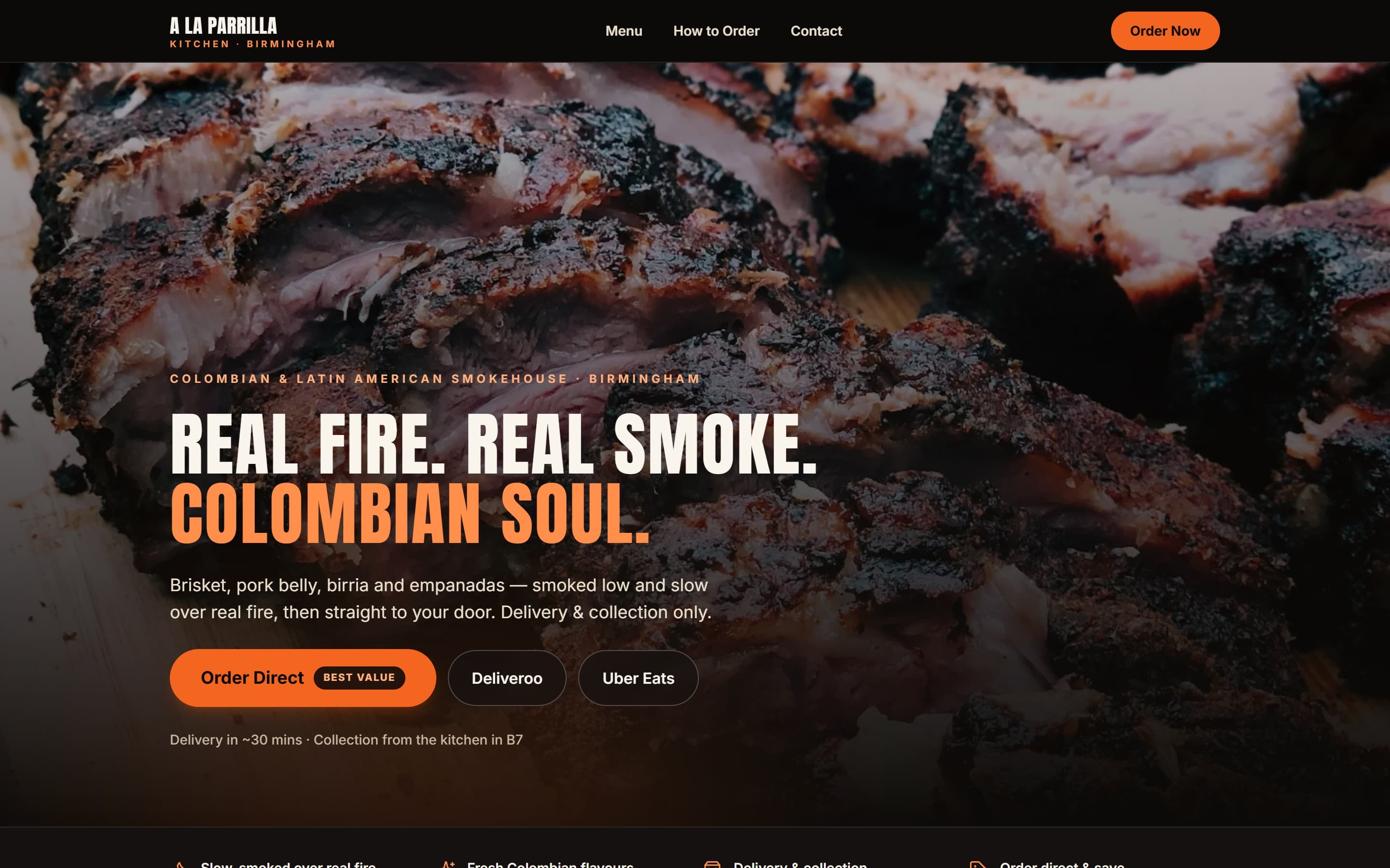
The brief
People decide what to eat tonight on their phone, already hungry. For a delivery-and-collection kitchen the site has one job: make the food impossible to scroll past, then take the order directly, so the kitchen keeps the margin a delivery app would have skimmed off the top.
The audience
Hungry locals ordering for tonight, mostly mid-scroll on the sofa. They decide in under a minute, and given the choice they'd rather order straight from the kitchen than pay a delivery app's mark-up.
Why it works
A warm, low-lit palette and an ember accent make the food the whole page. Ordering is the single hero action. There's no table to book, just the shortest possible path from a photo of the brisket to a placed order.
Design intent
In detail
How the page is put together.
Each section earns its place. Below, the decisions that make this a kitchens website and not a generic template.
Appetite-first hero
A full-bleed hero built to hold real photography of the food coming off the grill, with 'order online' sitting on top as the one thing you can't miss.
Order direct, skip the fees
The menu and the order flow stay a thumb's reach away the whole way down, and the site nudges people to order direct rather than through an app, so more of every order stays with the kitchen.
Let's build yours
Want a website like this for your kitchen business?
Tell us about your business and how you win customers. We'll design a site built to sell the way you actually sell.